Furnished By Hand
decor fabric textures hero

Upholstery and Decor Fabric Colours and Textures

You've probably heard them referred to as Upholstery Textiles, Upholstery Fabrics and Soft-Furnishing Material.  
This group of fabrics can be used to furnish a room with curtains, couch-covers, seat cushions, scatter cushions, pillows, footstools, throws and rugs. 
They're used to soften the hard edges in a room, making the space look and feel more inviting.
orange, tan and taupe luxury range decor fabric
There are so many textures, styles, patterns, weights and colours to choose from. You can get overwhelmed when deciding on the right decor fabric to pick for your project.

I always consider the colours first because the colours set the mood in every environment.
For example:
A stark white room clears the senses and allows for better concentration, while a lush green outdoor space feels calming and optimistic.

Colours and Textures

Speaking of favourite colours, I adore colours between the blue to red spectrum, most especially purple and anything related to it, i.e Indigo and Violet. 
Come to think of it, my love for these colours may also be the reason I love very stormy weather - asides from the atmosphere, I find the deep, dark colours so powerful and exhilarating. 
blue satin suede and velvet
My favourite textures are satin, suede and velvet. 

I like the way they look in any setting and the way they feel to the touch. There is something both romantic and regal about these textures.
Although we all have favourite colours and textures, we might not want to be enveloped in them all the time; I wouldn't want purple all over the walls, floors and ceilings.
living room furnished in purple
purple, grey and green accent room
Luckily, we can use gorgeous upholstered items and soft furnishings to pop accents of colour and texture into a room, which infuse character, beauty and interest, without over-whelming the viewer.

Colour Inspiration for Decor Fabric

I think of color as visual medicine. It can help me to focus, inspire me, change my mood for the better and even make me kinder and more sympathetic towards others.
While I know the range of colours I like, it's not so easy for me to decide which ones I want to be 'greeted' by every day. Sometimes, I end up dithering for weeks over the 'right' combination of decor fabrics to choose for my projects.
luxury hotel suite
Once upon a time, I thought it would be totally inspired to design our soft furnishings to match the colours from an amazing (gifted) luxury hotel suite we'd stayed in while in Egypt. I was sold on the idea of always 'being on holiday' - we could wake up feeling rested and fabulous and go to bed feeling relaxed. Genius!!
I become a lot less sold on the idea when I realised that the amazing hotel probably employed around-the-clock laundry staff, a 'rapid-response' cleaning team, and a squadron of upholstery and soft furnishing suppliers, to keep the suite looking amazing. Even if I could achieve 'the look', how long could I maintain it for?
hands wearing brightly coloured rubber gloves
luxury chocolate box
Another time, I'd wanted to design our bedroom like the inside of a sumptuous chocolate box with golds, deep purples, rich browns and lime greens.
But liking the colours and arranging them so that they actually look good together, are two very different things.
rows of textile patterns
Asides from the huge array of colours to choose from, Decor fabrics can also have designs or 'patterns' on them too, like : dots, stripes, chevron, plant foliage, sparkles, typography and a lot more.

Where Do You Start?

When choosing your Decor Fabric colours, a good rule of thumb is to base your scheme on colours from the same palette, that way you can be sure that your furnishings won't clash. Once you have decided on the main colours to use, you can add accents of colour throughout the room for contrast.

Who's the Colour Authority?

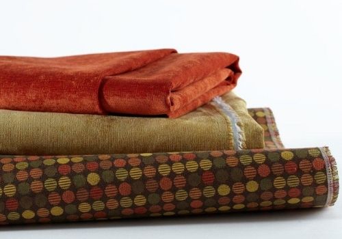
Pantone have been the world's leading colour experts since 1963; they were kind enough to invent a colour language that can be understood globally by designers and manufacturers.
The Pantone Color Institute provides color trend forecasting, color insights and customized color consulting'.
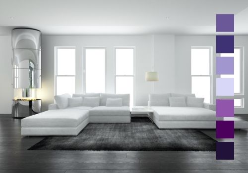
They are tasked with voting on the colour of the year. Last year's colour was Royal Blue. Pantone provide the most extensive and in-depth colour palettes for Colour in Design, including their Fashion, Homes and Interiors System (FHI) for Textiles.

Decor Fabric Textures

There are loads of different 'feels' or textures you can use for your interiors, from smooth and silky to soft and downy. Textures are an effective way to infuse elegance and personal flair into your home decor project.
As with colours, there's a knack to getting the fusion of textures just right. In other words, chucking together a bunch of textures because 'we've always really liked them' could spell disaster.
Using just one texture for everything will have a blanket effect. On the other hand, using an abundance of textures for all of your upholstery, can give your room a confused vibe.
It's believed that the eye notices the differences in textures before differences in colours.
You can balance out the textures in a room, by incorporating other mediums like matt wall coverings, wood floors, shiny accessories and plants. This helps to create a backdrop for your textured fabrics. You can pair a few light textures like cotton blends and linen with stronger textures like rich velvets, cashmere and faux furs.
You can go for style or ambience. Style refers to a particular trend: country, shabby chic, Minimalist, City Glam. Ambience refers to the feeling and atmosphere the room will exude.
The more specific you can be about what YOU want to see and feel when you walk into the room, the more you can pinpoint specific colours and textures that will help you to create the 'look'.

Start As You Mean To Go On

black and white with a purple accents colour wheel
beading
Stick to one look and try not to be eclectic or 'varied'.
beading
Decide on the look that you'd like to create in your room
beading
Ponder over that 'look',  take your time and take notes.
beading
What colours and textures remind you of it, what does the ambience feel like? Will the mood be relaxed and calming, functional and efficient or minimal and sharp?
Here is a breakdown of some home decor examples:

Decor Style 1

Ambience: Open, Inviting, Comfy, Velvety.
Personality: Powerful, Energetic, Enthusiastic and Happy.
Colours: Cinnamon, Deep Terracotta, African Sunset Yellow, Dark Red.
Textures: Rich Suede, Velvet, Glistening feather-light Cotton Blends, Luxurious Deep Faux Fur.
Other: Fabric Wall Art, Palm-leaved plants

Decor Style 2

Ambience: Efficient, Chic Minimalism, Sleek, Bold 
Personality: Tidy, artistic, reliable, strategic
Colours: Pewter, Gunmetal Blue, Brass, Monochrome, Copper,
Textures: chenille, faux leather, brushed suede
Other: exposed brickwork, thin, square and circular accessories

Decor Style 3

Ambience: Serene, Earthy Elements,
Personality: Natural, Calm, Intuitive, Smart, Thoughtful
Colours: delicate green shades, elements of black and white, taupe
Textures: wool, linen, patterned cotton
Other: Succulents and thick leaved plants, marble, typography, wood floor

Leave a Reply

Your email address will not be published. Required fields are marked *

cross